Our New Logo
Dear OSRUI Community, There is so much to be excited for as we get closer to summer 2021 in Oconomowoc! Just this past week we launched our camper forms for our 2021 families and we have a number of exciting projects underway onsite in Oconomowoc as we prepare for summer.
Today, we are excited to share an updated, new, logo for camp with our community! Our board and staff partnered together to create this exciting update for our logo that honors our past while moving us forward – a fitting message as we enter this summer after being geographically separated for so long.
Please read on to see a note from board member David Brot who chaired the task force that worked over recent months to design this logo. I am so grateful to David and the board task force for overseeing this project that honors our history and leads us into our next chapter. Thank you David!
— Solly Kane, Camp Director

Above: David Brot
A Note from David:
I have loved OSRUI since my start as a camper in the 80’s. Then, as a staff member in early 90’s, I met my wife Ilene at camp. More recently, our boys Joshua and Daniel were campers and staff from 2008 – 2019. And I have served on the OSRUI board for 15 years. In my 25+ year career at Leo Burnett advertising, I have worked on many brand identity projects, but in that time, no project has ever had such a personal connection for me as helping to shape the OSRUI logo for the next generation.
With more than 5 decades of use, Camp leadership felt that a logo update was needed, not only to reflect the changing ways people encounter logos, but also to make the logo more relevant with today’s summer camp audience. The committee wanted the new logo to communicate that OSRUI is a welcoming summer camp, filled with fun, Judaism and community.
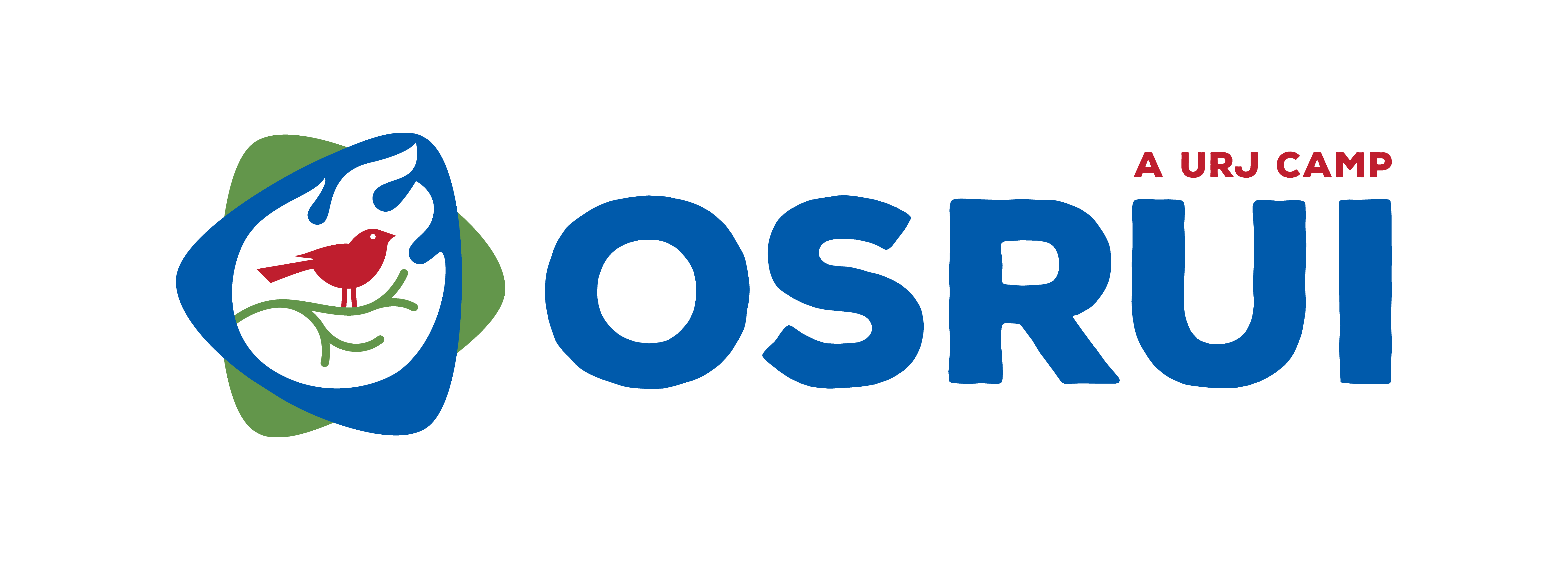
When you look at the new logo, you’ll instantly see a Jewish star, made of interlocking guitar picks. One of the key parts of the camp experience in any unit is music, so the guitar pick brings the importance of music to the core identity of camp.
Even more importantly, Judaism is at the core of what we do, so the Jewish star is now part of the logo to clearly show the importance of Judaism at camp. And Judaism at camp is different, because it happens outdoors. So the new color of green has been added to show the importance of outdoor experiences at camp. Another key difference in the logo is the addition of the word “camp.” We want to be clear what OSRUI is, from the first moment you encounter this logo.
And finally, we have kept the bird, branch and campfire. These are kept as part of camp’s rich heritage. A branch represents the connection point between being rooted in our Jewish tradition and the growth campers experience at camp. It is pointed up deliberately to highlight that growth. The bird represents the ability for campers to take flight as they leave camp, and ultimately leave their nests as they grow up. We see the flame as the flame of a campfire. The campfire is a universal welcoming symbol to anyone of the great outdoors. At OSRUI, it’s always a fun event. It also is a symbol of community — when units gather around campfires, this is a key time for community building.
I have immense gratitude to the members of the Task Force who worked on this project. Thank you to: Marla Brown, Emily Crane, Bob Cutler, Tori Franklin, Michael Lorge, Joe Seigle, and Steve Wolf for your time and input throughout this process.
If you have feedback about the OSRUI logos, please be in touch!